Trends come and go in every design industry, whether it be fashion, architecture, or web design. The internet, however, because of its wide reach and the ability for ideas to communicate so quickly, has become a place where rapidly changing trends spread like wild fire. The past few years have seen some amazing improvements in the world of web design, making the internet a more beautiful place to be and making most websites easier to use on your computer, tablet, or phone. Google and other search engines can claim part of the responsibility and merit for many of the new web design trends – as they have developed extremely advanced algorithms that target websites with the best content and the most user-friendly structures. Have you noticed that those annoying flash animated welcome pages are nearly obsolete? You can partially thank Apple for that development, as flash isn’t supported by iOS – but it’s also fair to say that web strategists are focusing more and more on the users, making sure they have the best experience possible and don’t get distracted or put off by unneccessary bells and whistles. As we move forward, web design is improving because it is focused on making websites simple and easier to use. A confusing website, no matter how beautiful it may look, is badly designed because it simply confuses the visitor and offers a bad user experience.
Therefore here are some of the most popular web design trends for 2013. Whether you are a designer or business owner who is creating a new website or improving an existing one, hope you’ll enjoy these web design trends and get some ideas for your next web project.
1. Flat Design
Flat design is a major visual trend that is currently peaking. What flat design aims to do is to remove all of the gradients, shadows, and shiny designs that have dominated the web in recent years. The goal of these designs is to create the illusion of skeumorphism, which means that the elements, like buttons, look 3D and touchable even though they are not. Skeuomorphism is being used less frequently as of recent – and there is no better way to represent this trend than with the newest iOS interface design. Previous champions of the round, flashy button style, Apple has now taken a cue from Microsoft and introduced buttons that appear flat on the screen. This bold and somewhat controversial step from Apple is a good indicator that this trend will probably last. Flat design is clean, good looking, and takes away all of the extra elements that could distract from what’s actually important – which is the content. Below are some side-by-side views of Apple iOS’ newest icon sets.
2. Responsive Layouts
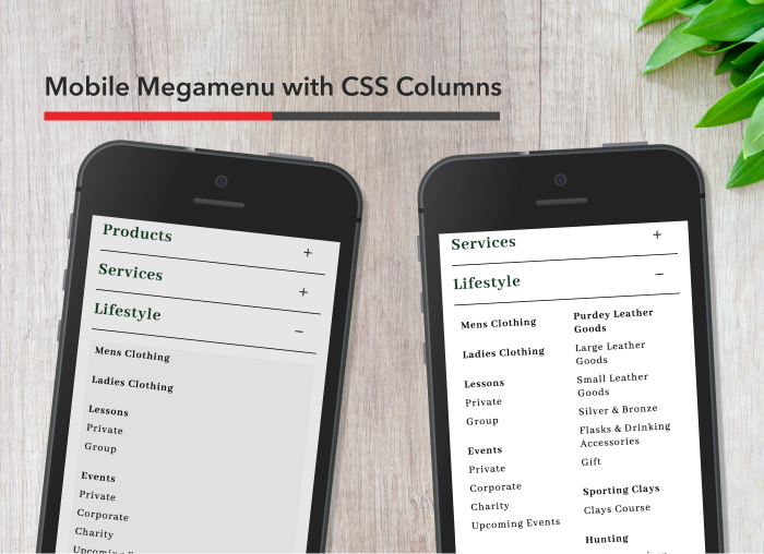
As more and more people turn to their phones and tablets to browse the internet, responsive design is gaining in popularity. The difference between responsive design and mobile design is that instead of having a separate mobile website, a responsive layout will react to different screen sizes and automatically adjust itself to look great on any screen. Responsive design is great because the ability to use the same URL and content across all devices is much better for SEO. Responsive design is also popular because nowadays, there are hundreds of devices with web browsers, and designing for only one or two of these things is simply a waste of time. Responsive design aims to accommodate any screen size, whether it by 27 or 2 inches wide. One possible downfall of responsive design is that it is much more difficult to design and develop – meaning having a fully functional responsive design will usually require a larger investment.
3. Fixed Header Bars
Fixed header bars are permanently attached to the top of your browser screen (if you’d like to see an example of one, just scroll down). They allow visitors to be in constant view of the navigation no matter where they are on the website. This means that they can quickly view the navigation menu and switch to another page conveniently at any time.
4. CSS Transparency
CSS transparency is the perfect solution for creating the illusion of depth while keeping with the trend of flat design. CSS transparency can give a designer the ability to layer one element over another, making the top element transparent and giving the illusion of layering with or without the use of shadows and highlights. Below is an example of CSS transparency.
5. White / Minimalist Design
The aim of minimalist design is to strip out any and all unnecessary elements in a website. White backgrounds create an extremely clean feel, and done right, can properly highlight important information to direct visitors in the right direction. White background are extremely current and trendy, and they are also a smart choice for readability. The white trend is a great example of the way web design has developed over recent years to accommodate visitors and try to make their online experience as simple as possible. While colorful, flashy websites are impressive – new trends tend to focus more on ease of use and functionality – presenting important information in the most readable way possible.
6. Parallax Scrolling
Parallax scrolling is a very cool technique that is new with the release of HTML5. In parallax scrolling, background images move more slowly than foreground images, creating the illusion of a deep layering and making for a very interesting user experience.
7. Infinite Scrolling
Infinite scrolling was popularized by websites like Pinterest and is an alternative to traditional website pagination. Infinite scrolling allows new elements to automatically load at the bottom of a page without needing to switch to a new page or reload the website itself. A good example of infinite scrolling is the Google image results page. As you scroll down your page, Google automatically loads the next set of results, giving you a much quicker and more convenient experience. Google has not yet implemented infinite scrolling on its web search results, still using the traditional pagination. Below you will see Twitter’s load screen for it’s highly effective infinite scrolling. Be careful when using this technique that you do not eliminate the footer as a resource for your visitors and that all of the links on your footer are readily available somewhere else.
8. Single Page Websites
Single page websites put all of the information in one place. Visitors can scroll through and get the most basic yet important information. This technique is great for companies that want to quickly capture the attention of visitors and who want to make only few very important elements immediately viewable. Single page websites will usually also feature a simple navigation system that takes visitors to a different place on the page with the information they are looking for. The downfall of single page websites is that they can be somewhat lacking in content – so they might not be a great idea for companies who are looking to gain traffic from search engines.
9. Full Screen Elements (type & images)
Full screen elements like images or type are eye catching and make the visitor feel like part of the experience. Full screen photos of interior or exterior spaces can take visitors to another world – making them extremely effective for travel or home websites. Full page text is loud and eye catching. If you have something important to say – say it big!
10. Personal Touches
Personal touches are currently trending – especially on portfolio and small business websites. The web can be a cold place – but letting possible clients get to know you is a great way to establish trust and make a great first impression. Designers, and design companies, will often prominently display a photo of themselves and write with a great sense of humor that lets visitors really feel like they are hanging out at the office or joking around with the designers. Creative people tend to create very casual work atmospheres – so it is nice to show visitors that while you can create a professional business website, you are a creative person who has the imagination and spunk to design something for them that is unique and beautiful. The designer below has found a creative way to help visitors get to know him.
Do you know of another web design trend that wasn’t discussed in this article? Please feel free to comment and share below.
Customer Success Manager


