A well designed website can attract visitors, establish your brand personality, and keep customers excited and interested. The visual experience that users get while visiting your online store is important, but improving the overall user experience is the best way to be sure your customers feel comfortable, happy, and safe.
There are many types of customers and the best way to lose them is through confusion. Customers who feel confused or frustrated are quick to abandon your store. The goal of User Experience design is to create a simple experience, where customers are in control. Instead of assuming you know how they will move through your store, allow them to choose their own way. Whether they’d like to hop from product to recommended product, or are a skeptic who wants to learn more about your business, a good user experience will leave them happy and satisfied. Avoid forcing customers to take any actions, and focus on creating an organic experience that feels natural. Below are my simple tips that you can use to improve your store’s User Experience.
1. Don’t overload or overwhelm
Store owners often want to showcase a lot of information immediately. While the store certainly contains a lot of important information, it’s important to keep it organized instead of bombarding visitors with all of your latest blog posts, all of your policy info, and three different product sliders. Instead, focus on making all of this important information easy to find for the visitor who wants to view it. Consider informational hierarchy and choose the one or two elements that you want users to see immediately, then make it as easy as possible to get through the rest of the shopping experience. Images are excellent attention-grabbers, but behavioral studies have shown that a large, bold headline is where users will look first.
2. Avoid confusion at all costs – Simpler is usually better
The best way to lose sales for your online stores is to confuse your customers. User Experience testing, analytics, and feedback from your shoppers should give you a good idea of any problem areas. Once you target issues, consider simplifying areas that seem confusing. Remember that lists are easier to read and internalize than blocks of paragraph. Icons are a good way to draw attention, and to illustrate concepts that might be complicated or confusing.
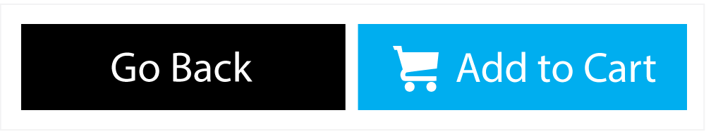
3. Different buttons for different actions
The most important buttons on your store are your add to cart, proceed to checkout, and complete purchase buttons. These buttons should not share the color of all of the other navigational buttons that appear throughout the store. They should be eye-catching and should use color contrast to stand apart.
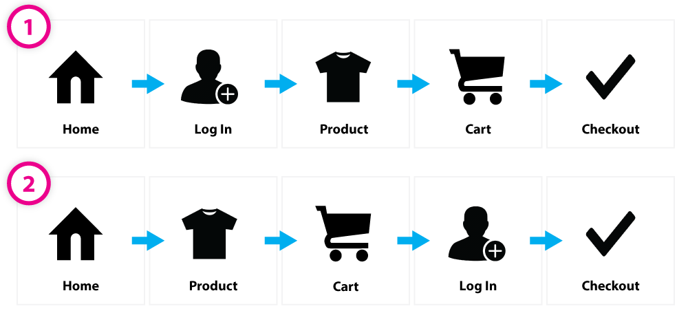
4. The user is in control. Let them find their own way around.
Some people think that the user experience designer must control the way a user moves around the website. While the UX should prompt and encourage visitors to behave in a certain way, they should be able to navigate through the pages in any number of ways as easily as possible. While many store owners assume that a visitor will land on the home page, then find their way to a category page, a product page, cart, and then checkout, consider other ways. How does the flow work when a user wants to log in from the product page? What if they choose to wait to login from the cart or checkout page?
5. Understand expected design standards
It’s always a good idea to get creative and give users something they haven’t seen before. However, there are certain user experience elements that are universally expected standards. Getting too creative with these elements could possibly cause confusion.
- The logo should occupy the top left corner of the page, and should serve as a link to the home page
- Text that is underlined is a link
- Buttons should change appearance on hover, and should change the cursor to a pointer on hover.
- On mobile navigations, a “hamburger” shape expands the navigation
- Important contact information and basic company info (address, policies, etc) should exist in the footer
- The search bar should exist in the header, usually on the right side, opposite the logo
- The user account information and mini-cart should exist in the header, usually on the right side, opposite the logo
6. Step away from the designer role and think like a user.
There is endless information available about design best practice, color, layout, and form. Design is a fun and interesting way to add personality to your website. While user experience design is indeed design, you shouldn’t always approach your store from a designer’s perspective. Rather, when doing UX design, it’s important to take some time to step back from the design and view the store as a user. Remember that there are many different kinds of users. Some are simply browsing. Some know exactly what they are looking for and want to learn all there is to know about the products.
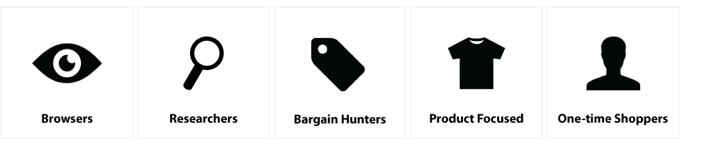
Consider the experience from the Point of View of different styles of shoppers. Decide which shoppers you want to attract and keep on your page.
- Is it easy to get through checkout whether or not you choose to log in?
- How is the experience different based on how familiar a user is with your brand and products? How easily can they learn more about you and learn why they should trust you?
- If you find a product you like, how easy is it to find other, similar products that you may also like?
- How can you easily save products that you aren’t ready to buy yet?
- When viewing a product, pretend you’re handling that product in a store as opposed to online. What do you learn about the product’s size, weight, stretch, fit, materials & movement? Can you learn the same thing about the product online, or are you limited?
In Conclusion
In our opinion, designing a website is the most fun part of the process. Experimenting with colors and layouts and capturing the brand’s personality is an exciting challenge. Equally important in the design process is to step back and think like a user. While we can sometimes get caught up in making things look pretty, we forget that the purpose of the store is to make users feel comfortable, happy, and safe. We need to consider different users and their experiences in order to get them from point a to point be however they choose to do so. By following this simple advice, you should be able to wow your customers and create a pleasant shopping experience.
Customer Success Manager