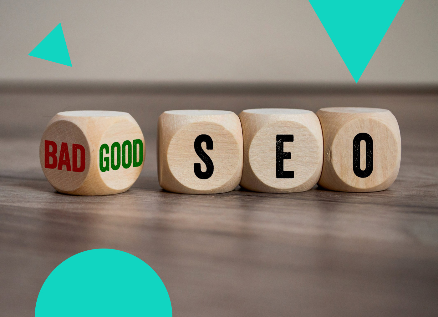
To improve user experience and maximize sales online merchants add lots of functionality and useful content about their products and other elements pertaining to their website. But going overboard with these elements can cause problems with conversion. The following elements can ruin the conversion rate for an eCommerce website. This list can serve as a baseline for some of the main elements that have the greatest impact on conversion.
Avoid Pop-Ups
The most typical form of a pop up is an offer or a newsletter sign up. Many users just close the pop up before it has even fully rendered. The best way to present a newsletter sign up or something similar would be to have the option presented after a predetermined amount of time (this will signify that the user is interested in your site). Or you could have the newsletter sign up in the header or footer of the site where the user will most likely see it. Think about it this way, if you were to walk into a store, would you sign up for a newsletter right as you were walking in the door?
Don’t Use Flash
There are several companies that wonder why they have a large bounce rate from their homepage and the usual reason is that the customer can’t figure out what kind of business you are or the call to action you are trying to have them make when they visit your site. Using Flash, customers have a problem waiting for the site to load just to search for what they are looking for. And another problem? Flash won’t get indexed by search engines because search engines can’t read it!
Broken Links
Broken links that send users to 404 error pages can negatively impact revenue. There are many instances of 404 errors and pages not being found by visitors. If a product is out of stock or unavailable, you have to make sure that there is a message that states that the product is not available or out of stock. Having the product page appear blank is a sure way to drive away customers who will feel like your website has only error pages.
Don’t Auto-Play Anything
Please avoid having auto-play audio, video or animation unless the user clicks on it. This will only attract the wrong kind of attention from your visitors. Your visitors don’t want to hear the voice of a man talking in the background of their computer – they will freak out and try to shut it down because it is interrupting what else they are doing at the time.
Grammatical Errors
When customers notice that there are several grammatical errors, typos or sentences that are awkward, it will leave a negative impression about you and your website. This will lead to reduces conversion rates. Make sure you are not driving away customers solely because of grammatical errors. Hire an editor and get your copy edited.
Distracting Social Sharing Buttons
Do social media buttons help conversion optimization or do they distract the user from the purpose of the website?
A case study, done by Visual Website Optimizer, showed that with removing the social sharing button, an 11.9 percent increase of conversion rate occurred compared to the website with the sharing buttons.
Some suggestions for social sharing buttons:
- Have the social sharing buttons only on the confirmation page following a sale. That is an ideal time to encourage viral sharing.
- You can try out A/B split testing to see how your conversion rates change on the product page with and without social sharing buttons.
- Consider using smaller buttons that aren’t as distracting, or redesign them so they are more appealing to your customers.
Impossible Captcha
If you have validation on your side – which is a good idea – make sure that a human can actually validate it. What’s worse than not being able to read the content to validate it? There are several different services available for captcha so run an A/B test to see what works best for your audience.
Not Having Attractive Photographs
Online shoppers are visual. If products look attractive, customers will be tempted to buy. Your products should be presented in a professional and attractive manner. If they are not presented attractively, no one will purchase them. Hire a professional photographer to take your product photos and upload only the ones that look the most attractive.
These tips aren’t only the issues customers spot in eCommerce websites but these elements can greatly reduce your chances of your website being successful and it will reduce your conversion rates. Follow some or all of these tips and you will most likely see your conversion rate increase. Don’t forget to test all the changes that you apply.
Support Operations Manager