So, you created a Bigcommerce store, and you want to increase conversions. Now, through the design choices and advanced built in functionality Bigcommerce has to offer, your site can be easier to navigate and have an overall better user experience.
Want to learn more about Bigcommerce? View our introduction article.
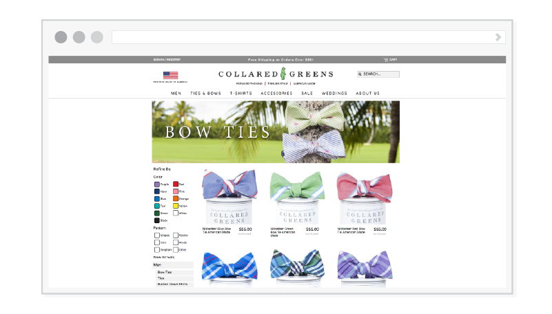
Category Page
We can start with the category page since most customers land here first when shopping. Depending on what sort of products you’re selling, there are a few key elements you should keep in mind when it comes to the category page.
- Product filters. Filters are typically seen on the left side or top of the category page. They are crucial if you have a lot of products that range from different sizes, colors, prices, etc. Filters help customers narrow down what they’re looking for much faster, and improves the shopping experience.
- Quick view option. The quick view is a button that can be viewed when you hover over a product on the category page. When clicked, a pop up with a summary of the product details are shown. The quick view isn’t necessary, but it helps the customer browse through products without opening a separate product page. It’s much faster than constantly going back and forth.
- Add to cart and compare call-to-actions. Letting your customers add products to their cart directly from the category page will ensure for a faster shopping experience. If this customer is already familiar with your products, it’s not necessary for them to go right to the product page since already know which product they want to buy. Another feature that helps with the decision process is giving your customers the ability to compare products, which usually located near the add to cart button. Customers are able to compare two products and their features.
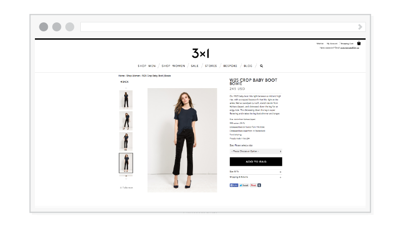
Product Page
The Product page is where can let your products shine, and even brag a little. When customers click on your product page, it’s a that’s good sign that they’re interested! Below are some important points to think about to keep attention of your customers, and help them make the right decision.
- Large images with zoom function. Large images with zoom functionality lets customer take a closer look at what they might buy. Since they’re sitting at their computers and not in an actual store looking at your product, they rely on you to provide high quality imagery to help them with the decision process. If your images are blurry or pixelated, there’s a high chance they’ll just close out. Try to keep the background on your products clean. A grey or white background is always best since it doesn’t contrast with the product.
- Prominent add to cart. Your add to cart needs to stand out from any other element on the page (besides the product). This call-to-action helps guides your customer to checkout without any confusion. It’s a good practice to make it large or brightly colored, or even both! It needs to instantly grab their attention.
- Product reviews. Having product reviews available to customers helps them with their decision process. They look to see if other people were satisfied with your product, and if it’s worth buying. Product reviews are usually seen in two areas of the product page: under or above the short description near the top, or down below under your longer description or related products. Normally, if a product has a review, a customer knows automatically by seeing how many stars or hearts are highlighted.
- Recommended products on display. Recommended products (or related products) are most completely seen on the product page. Basically, they are products that are related to the product you are currently looking it. This is helpful for customers who are trying to put an outfit together. The site could recommend a pair of pants or shoes are associated with the current product.
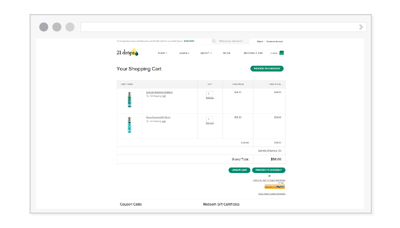
Cart
The cart (sometimes referred to as bag) is where your customers review and double check what they want to buy before heading to the checkout. The cart should be straightforward and easy to understand.
- Editable items in cart. When a customer is prompted to their cart, they shouldn’t feel stuck or restricted. Sometimes they make mistakes choosing their product options and need to go back to the product page. Allowing your customers to edit their cart will make things much more efficient, and they don’t need to re-add the product to their cart. Usually the ‘Edit’ link is located near or under the product name and attributes.
- Update cart and proceed to checkout call-to-actions. The update cart is sort of like a refresh button for the customers cart. If a customer decided to change the quantity through their cart, the cart will automatically update when clicked. Like stated above, customers don’t have to go back to the product page to update information.
- Coupon/promo codes and gift certificate options. There’s a good possibility your store will give out coupons and promotional codes at some point. So, having the option to apply these codes within the cart will let customers use their coupons easier, which will result in more sales.
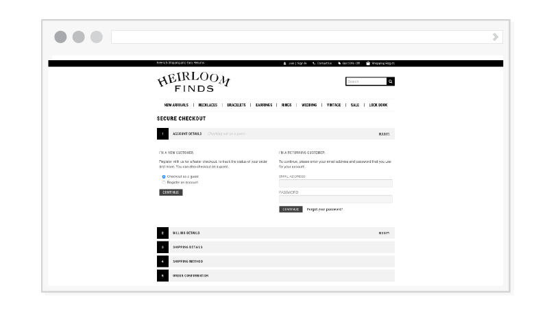
Checkout
The checkout is where customers are ready to pay for the product they want to purchase. Since this feature is extremely important to all eCommerce stores, the checkout process should be painless and quick.
- Allowing guest checkout. This is crucial for a lot of customers. Most don’t want to sign up and make an account just to check out. They want to quickly buy the product as fast as they can without any hassle involved. Allowing to checkout as a guest will lead to more sales and happy customers.
- One page checkout. Having your checkout process solely on one page makes it easier and faster to buy products. Your customers will have a better user experience if they don’t have to be prompted to a separate page when filling out their information. Each step will automatically load on the same page, and customers have the ability to go back if needed.
When designing your Bigcommerce store, keep these tips on hand. Yes, it’s ideal that your store should look aesthetically pleasing, but it’s good practice to make sure the category, product, cart, and checkout pages have a good flow for customers first.
Graphic Designer

