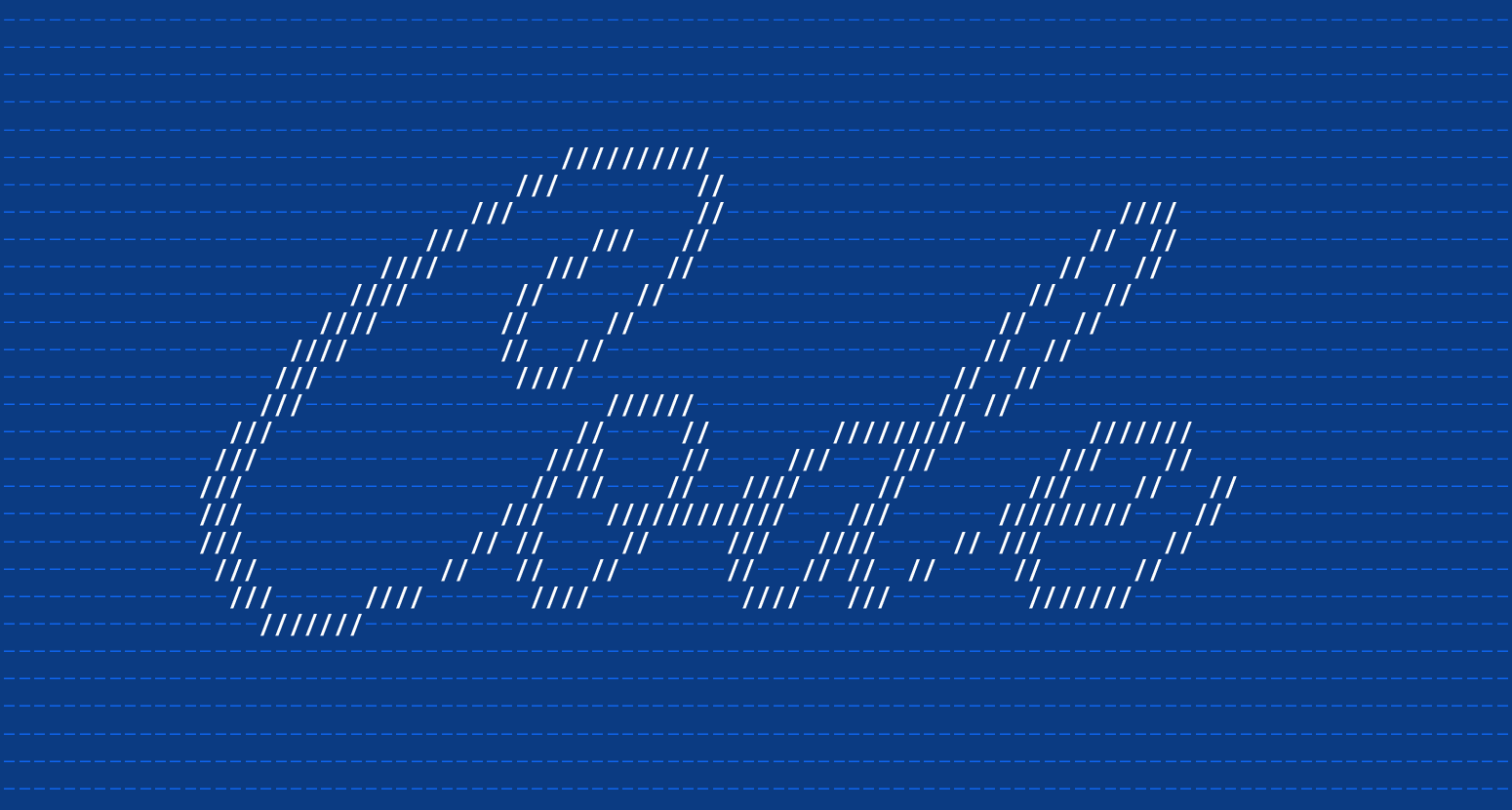
After four years, the Shero Designs logo gets a fresh new look.
Besides designing and developing websites for mid to big size companies, our team is comprised of three talented graphic designers Jillian (Me), Caitlin, and Beth. Although the main part of what we do is web design and front-end development, all three of us come from a strong graphic design background. Hence, today I would like to share with you the conception of our new and revamped logo. Our approach during the whole process was to design a clean yet, timeless logo that represents Shero Designs and what we stand for as a company.
Shown below is a comparison between the old and new logo:

Phase One – Manual Sketching
Before we started working on the computer, we began to do some manual sketching with pencils, pens, and markers. It’s easier to brainstorm ideas in a sketchbook before directly working on the computer.

Phase Two – Picking the Right Font
Picking a font is probably the hardest part in the whole process because it has to be just right. We decided on using a san serif font, but we still weren’t sure which one and if we wanted the logo to be in all capital or lowercase letters. Once we narrowed down the fonts we thought could work, we decided to go with the lowercase letters.


Phase Three – Making a Decision
After picking the right font, we were trying to figure out how to incorporate the Shero Designs red in the logo. The challenging part was to still stick to the concept of having a real simple logo without the red becoming too overbearing. We decided to minimally bring in either some sort of red element or make some part of the type red. Shown below are a lot experimental designs and how we got to the end result.
You can see what worked and what didn’t.


Final Logo Design
Here is the logo we all agreed upon after all the changes and alterations:

When trying to choose the right logo, the Shero Designs team agreed on a black san serif font with a red and dark grey line beneath it. It follows our original concept and still comes off as a strong design. We believe our new logo portrays us as approachable yet; still serious about the work we do for our existing and future clients.
Graphic Designer