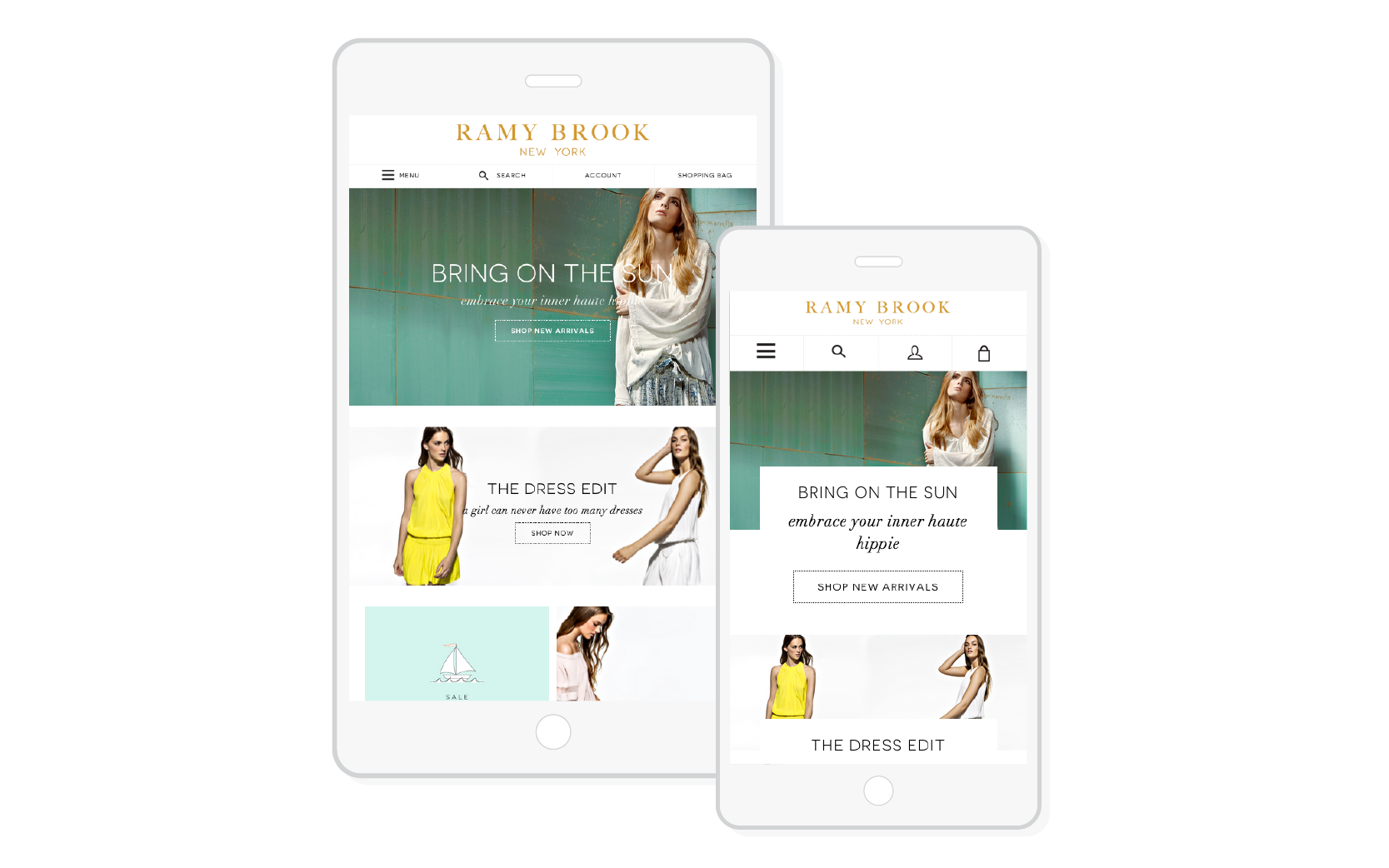
No Responsive Design
It’s 2015, your eCommerce website should be responsive. Everyone’s carrying around a mini computer in their pocket or purse. You’re missing out on sales by having a website that’s optimized only for desktop. Yes, customers can still view your website on their mobile device, but it will certainly not be easy for them. Customers won’t be able to browse through products comfortably if they have to constantly zoom in and out. Your content needs to adjust and look good on every device.
Ramy Brook does an excellent job condensing the content without removing necessary information. As you can see, the navigation and header links gets smaller and easier to use for a mobile device. The text and icons enlarge for easy navigation on phones and tablets.
Not Engaging Customers
When customers first land on your eCommerce site you need to keep them engaged. Properly telling your story and guiding the customers to learn more about your products or services will gain their trust and lead to more sales. On your home page, you need to be straightforward and clear on the services you provide, or what your company does. Customers want to know what you do and have to offer from the beginning. They aren’t going to search for more information if they’re already confused.
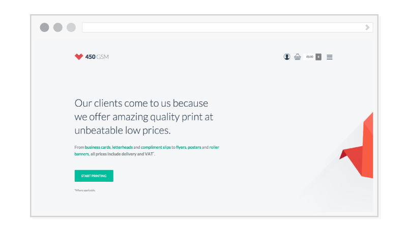
450 GSM lets potential customers know exactly what they offer when they land on their home page. Big, minimalistic text with a solid background and a bright colored call-to-action lets the customer focus directly on the text, and where to go next to learn more about your company.
Impossible Filtering
Product filtering is used to help customers narrow down specific items they are looking for. It’s usually seen on the category pages in the left sidebar or at the top above all the products. If your filtering lacks certain categories, it’ll be difficult for your customers to navigate through your products fast and efficiently. Another problem that could have customers leaving your site is if your filter doesn’t function properly through programmatic errors. The wrong items could be loading, or the filter doesn’t load at all.
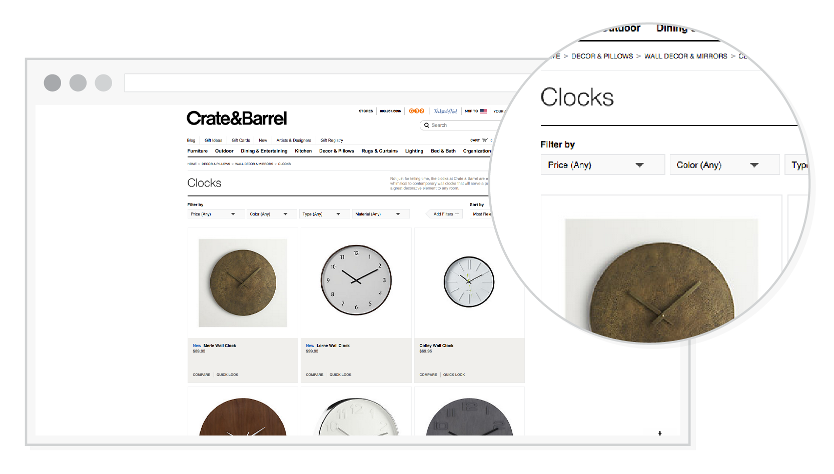
Crate & Barrel made it easy for their customers to filter through products by adding their filters at the top of the category page. It’s simple and straightforward.
Bad Product Imagery
Your product page is where you show case your amazing products. Why have crappy photos? Small, blurry, or pixelated photos aren’t ideal to use when trying to make sales. You need your customers to trust you. Since customers can’t physically touch your products, they rely on you to provide high quality imagery so they know what to expect when that package arrives on their doorstep. Potential customers don’t want to take a 50/50 chance when they’re spending their money. They need to be reassured on what they’re actually buying.
There are a few things to keep in mind when trying to avoid bad product imagery. First, it’s extremely important to shoot high quality photos. If you know your way around a camera, you can easily do this yourself. If not, I recommend hiring a professional photographer. Keep in mind that you need good lighting and a clean backdrop. White or a muted color is always best. Third, shoot multiple angles of your product: front, back, side, etc. It’s also helpful to provide more images of your product if it comes in a variety of colors. By doing so, you start to earn your customers’ trust.
Learn more about product photography >
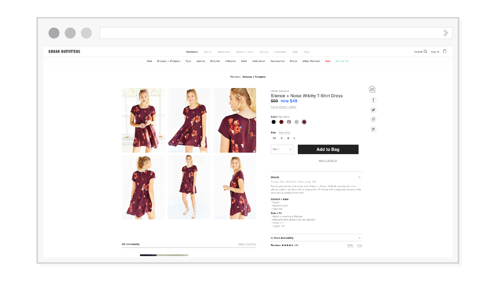
Below you’ll see that Urban Outfitters has multiple views and colors of the dress. By providing these images, it shows that they care about their customers, and want them to see exactly what they are buying.
Non Existant Instant Cart
If you don’t know what an instant cart is (also referred to as a mini cart), it’s a drop down that appears in your header navigation when a customer adds an item to their cart. This allows them easy access to the items they want to buy without going straight to the checkout. Most of the time you’ll see a number near the cart button in the header indicating that there are items in the cart.
A main issue is that some eCommerce sites do not have an instant cart. This tends to confuse customers due to the fact they do not know if there are items saved in their cart. They could potentially click on “Add to Cart” twice and not know they added the item two times to their cart. Since this is can be a problem, customers need to know if an item has been added to their cart.
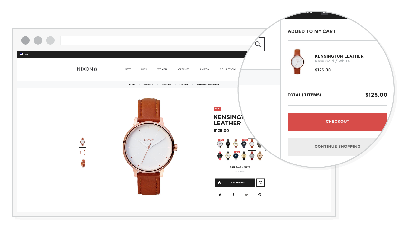
Nixon has a minimalistic and straightforward instant cart. It clearly states that an item has been added to your cart, an image of the product, total, and a large checkout call-to-action. Something this simple can go a long way. Less abandoned carts and more transactions.
Confusing Cart Call-to-actions
The cart should be an no-brainer for your customers. It’s a good start to make your “Proceed to Checkout” call-to-action a completely different color than the rest of the call-to-actions on the page. Making “Proceed to Checkout” a different color will help guide the customer to checkout – they will be automatically drawn to it. A bright color that’s still within your branding rules should be used. By having all of the buttons the same color, there’s a good chance your customers may get confused at first glance if all of the call-to-actions are the same color.
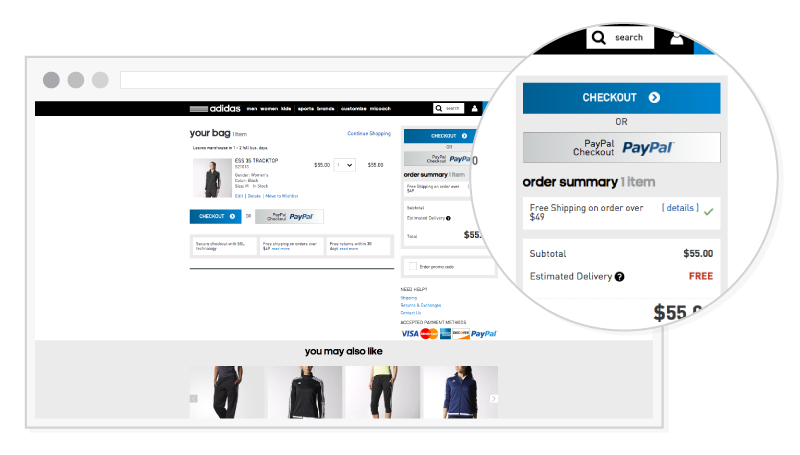
When landing on Adidas’ check out, you automatically see the large checkout call-to-actions. Nothing else is the same color so there’s no confusion on where to click next.
Difficult Checkout Process
You wouldn’t want to make your customers work just to check out, right? Providing a checkout process that’s difficult to navigate will cause frustration and abandoned carts. Your checkout needs to be straightforward; not everyone is patient. Customers are looking to buy their items quick, so there’s a high chance they’ll leave if something seems complex or out of the ordinary.
Provide simple and effortless steps that guide the customer through the checkout process. To make the user experience even better, have the checkout solely on one page. This is less intimidating and much faster to use.
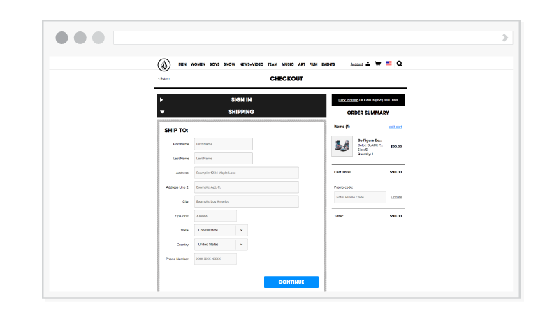
Volcom makes it easy for the customer to check out. The process is set up in an accordion menu so the customer isn’t constantly prompted to a new page after they type in their shipping and billing information, etc. Volcom utilizes the extra space with a sidebar. Like Volcom, you can have the order summary listed, or any other information that may be useful for the customer.
Although simple the above examples tend to be overlooked by many online merchants that are building a new website or re-doing their old website. Hope these tips will help you on your next eCommerce project. If you have a question, feel free to comment below.
Graphic Designer