Every year web design trends change fairly quickly. Some stick around longer than others, and some can can get pretty overused. Sticking to what’s always trendy isn’t always the way to go, but a designer can always take those trends, build upon them to create your own unique style. Listed below are some great examples of what’s popular in the eCommerce world so far in 2015. Some still have a traditional layout whereas some are little more abstract.
Here are some eCommerce design trends that are starting to develop in 2015:
Minimalistic Typography
Simplicity has been popping up a lot on eCommerce websites. Minimalistic typography plays a huge role in this. In order for your type to work, it has to be elegant and functional at the same time. It still needs to make a statement, but needs to take a step back to let your products shine. Using minimalistic typography can really showcase your products.
When thinking about using a minimalistic style on your eCommerce website, you have to keep in mind what kind of typeface to use, the hierarchy of the type, and color. In the example below, Kringle Candle does an excellent job of highlighting their products while still maintaining a minimalistic approach with their type.

Full Width Backgrounds
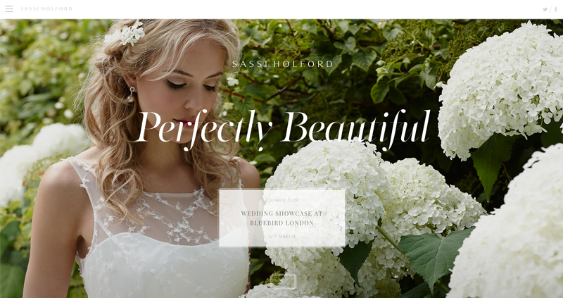
Full width backgrounds aren’t for every eCommerce store, but it definitely grabs your attention and provokes emotion. Since it will be the first thing a visitor sees, it sets the mood for the rest for your brand and story. Below, Sassi Holford displays a woman wearing one of their dresses standing next to flowers. This gives off the message that their dresses are just as elegant and beautiful as a flower. Some companies will want to go even bigger and make the background a video instead of a static image.
You won’t see too much text on a full width background. Perhaps you will only see their logo and a line of text that says something powerful to draw you in. All the elements on the page are minimal to let the photograph relay the message they want their visitors to receive. Sometimes they’ll be a call-to-action that directs you to the rest of the website or if you scroll down, the background disappears due to parallax scrolling.
Life Style Photographs
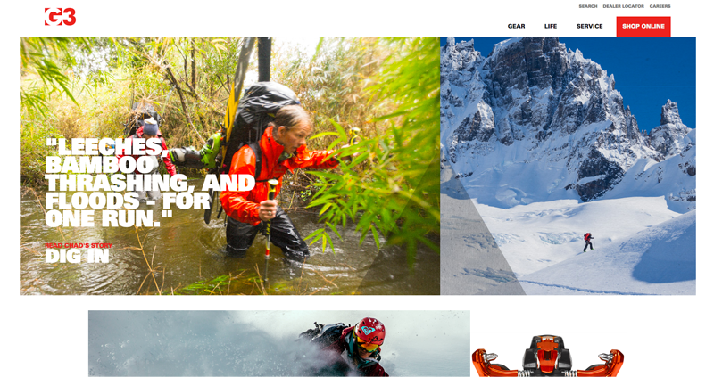
You may have noticed that life style photographs have been popular throughout eCommerce sites. Life style imagery shows the customer the products in action and how the customer would be apart of that lifestyle if they buy the company’s products. Similar to full width backgrounds, photographs with people using your product displayed on the home page or throughout your site provokes emotion as well. On Genuine Guide Gear’s website, you see people doing these extreme activities. They are trying to say that you can do this too if you buy our products.
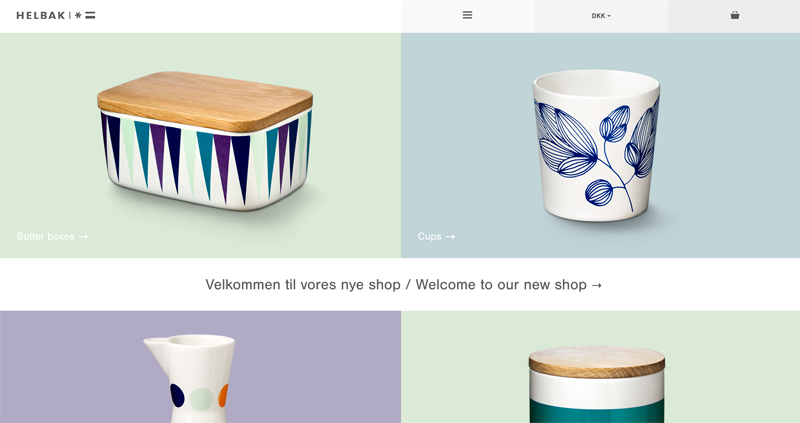
Large Product Images
Large photographs of products on the home page has been pretty trendy throughout eCommerce websites. On Helbak’s website, they completely eliminate banners and sliders, and go right to point by adding the product categories. The large items guide the customer to where they need to be. Instead of clicking through the navigation to find where the cups are, they can simply click on the large image of the cup displayed on the home page. This is a clever way to eliminate any confusion for the customer while receiving much more conversions on your site.
Hidden Navigation Menus
Hidden navigation have been showing up on desktop layouts quite often. Normally, they would only be seen on the mobile view of a website, but sometimes this works for eCommerce websites if they have a lot of content on their home page. Hidden navigation menus have a similar functionality to a mobile website too. When clicking on the “hamburger” icon (usually shown as three lines), the rest of the navigation will show up either on the side of the page or top. You will see this a lot with full width backgrounds so the visitor can focus the content first.
White Space
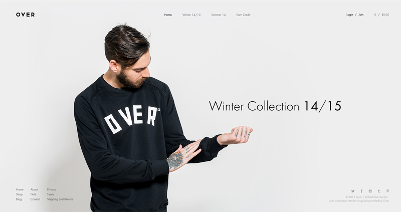
White space (or negative space) has been pretty trendy throughout eCommerce websites as well. Websites who utilize white space break the mold of a traditional website. You’ll see more space between type and photographs that usually stretch across the screen instead of being confide in a set width. This technique can be difficult to achieve at times because you need to think about the user experience and how they will navigate through your website. Since everything is not in one spot, this may confuse some people. The light grey background and black text on Over’s site makes it easier for the user to see.
Over is a good example since they have a lot of breathing room for the type, use barely any color, and have a background image that draws you in. A lot like what I’ve stated above under minimalistic typography and full-width backgrounds, this eCommerce website wants the visitor to focus on the figure wearing their merchandise first before navigating throughout their site.
Ghost Buttons
I’m sure you’ve seen ghost buttons on a lot on eCommerce websites lately. They are seen mostly on websites with busy, full-width backgrounds. This is so the button doesn’t take away from what they are displaying behind it. The user will still be drawn to the button, but it just won’t be the most dominant element on the page. A ghost button is just like any other button. It functions the same except it’s transparent hence the name “ghost”. These buttons are useful if you don’t want a big, bold button on your site. Ghost buttons look their best when they are in front of a background or pattern.

Conclusion
After reviewing the above websites, you now know what’s been popular throughout eCommerce websites and can use these trends as inspiration for your own store. Just remember to always think about the user experience and how your website will function. Your website doesn’t have to be extremely trendy, but keep in mind it is good practice to stay up-to-date and fresh. Now build upon those ideas and start your own trend.
Front End Developer