This post is the first in a series of blog posts devoted to the foundation of your eCommerce brand: Your brand personality. Before we dive in, let’s discuss what a brand personality actually is.
What is Brand Personality?
Brand personality revolves around a few key points. First is your brand traits. This involves understanding the actual characteristics of your brand. Some examples may include: funny, enthusiastic, trustworthy, or laid back. These traits are combined with your brand voice. How does it talk? What does it say? These questions along with the traits help narrow your focus so you can talk with your customers. Your brand personality is communicated through every design element, from image selection, to color, to typography choice, to the tone used in your text content.
The Role of Typography
Our first topic is typography. To understand typography and its place in your brand personality, we can turn to the world of architecture.
Architects use space and form to define moods and functions within a building. Their utmost concern is how people will experience the space. While the architect is designing, they begin working with an engineer. Together the architect and engineer figure out how to build a building that will fulfill both the function and feel needed within the space. This collaboration makes the building work for all parties involved.
Typography is very similar. Designers play the role of both architect and engineer. When making decisions about a brand’s typography, they balance both aesthetic and utilitarian functions. The aesthetic architect side revolves around feelings, space, and people. The utilitarian engineer side revolves around implementation, legibility, and readability. Typography helps us feel language, while also allowing us to clearly and concisely understand what is being said.
The Typography Balance: Serif vs. Sans-Serif
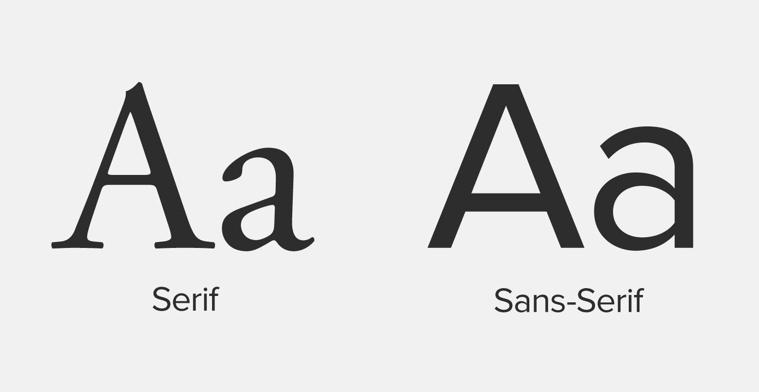
There are two major classifications of typefaces: Serif and sans-serif. Serif typefaces have a serif—a small flourish—on the ends of each letter stroke (See Figure 1). Sans-serifs, as the name suggests, lack these serifs.

Historically, we use serif typefaces for paragraphs and long-form body copy. This is because serifs establish a flow. Those tiny strokes visually connect together to guide a reader’s eye across words, sentences, paragraphs, and pages.
We traditionally reserve sans-serif for shorter lengths of writing, like headlines or titles. Their subconscious message is one of emphasis; they tell the reader to pay attention to each step, rather than the entire “dance” of the text.
Is Your Brand Serif or Sans-Serif?
With this basic knowledge, you can start to understand how to use typefaces for communicating brand personality. If your brand tends to be loud and brash, then you may want to use a sans-serif typeface to send a bolder, stronger message. On the other hand, if you want to communicate trustworthiness, you may opt for a serif typeface to put your demographic at ease. Serif typefaces feel more traditional, so they can help your customers feel like they can trust you; they say “I’m reliable and won’t rip you off.” These are very basic deductions, but they are powerful ones.
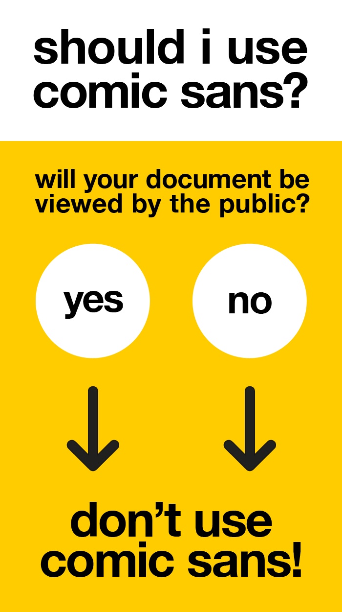
Think about a very common internet-joke font, Comic Sans (See Figure 2).

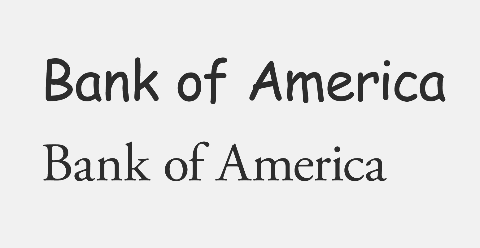
If I write “Bank of America” in Comic Sans, you’ll have a hard time taking it seriously. In contrast, if I write that name in a serif typeface, you’ll naturally look at it with trust and credibility (See Figure 3). But why does this happen?

Well, Comic Sans emulates a child’s handwriting. I would wager a bet that you wouldn’t trust a child with your entire life savings. But a serif typeface emulates calligraphy. A person who practices calligraphy is detail-oriented, has a great appreciation for doing things correctly, and so on. Those are all attributes that make a bank a good bank. This is how typography works. It relies on a combination of historic and cultural norms to help communicate what you want to say.
Defining Your Brand Voice
So much of this topic comes down to the nuance of different brands. The best thing to do is to ask, “How do I want my customers to see me?” Here are a few steps that will help define your personality:
- List out 5-7 traits describing who your company is in an “x but not y” format. Things like funny but not goofy, or trustworthy but not stodgy. Defining both who you are and who you are not will narrow your focus and help you articulate how you want to talk to your customers.
- Clarify your brand voice. If your brand could speak, what would it say? How would it phrase your messages? Does it use lots of vernacular? Or does it boil things down to simple layman’s terms?
- Record and refine your answers. Just because you do it once, doesn’t mean that you’ll never need to do it again. Brands change and mature, just like people. To keep up, make sure you revisit these elements one a year or so.
Our next post will discuss choosing and using color to help define your brand voice. We’ll talk about color theory and science. And how they can help you define your personality while providing a great user experience for your customers.
Interested in a deeper dive into typography? Here are a few great places to get started:
Butterick’s Practical Typography


