
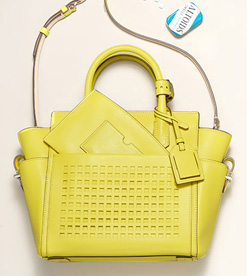
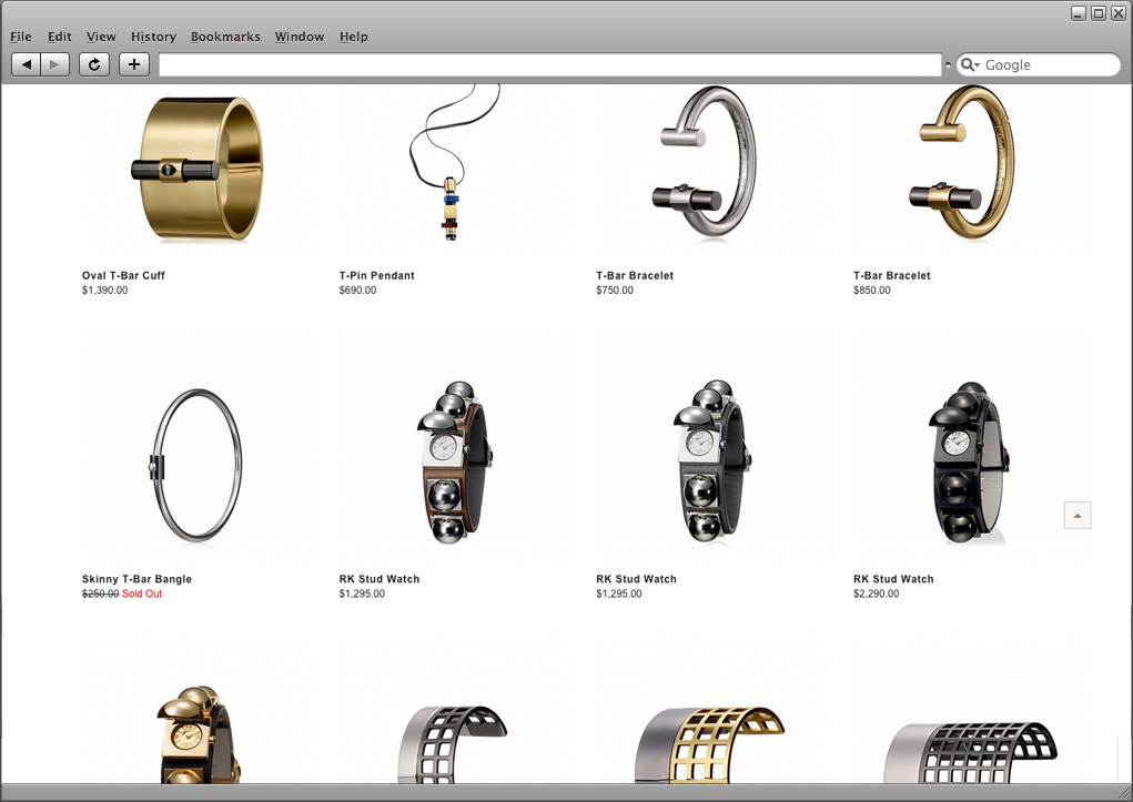
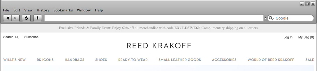
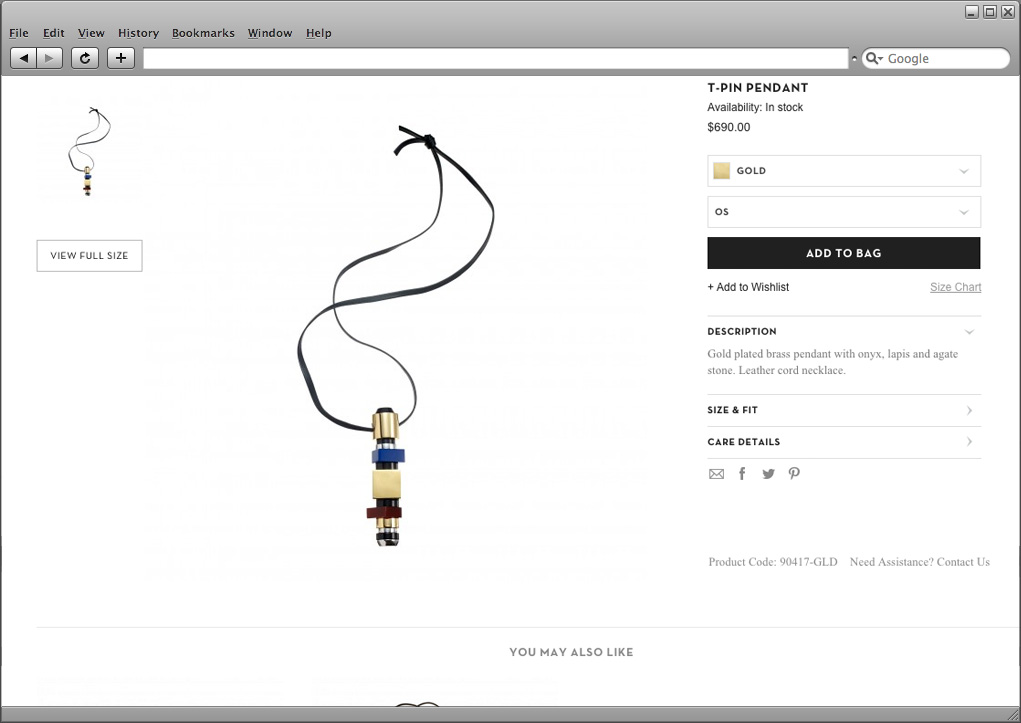
 Reed Krakoff
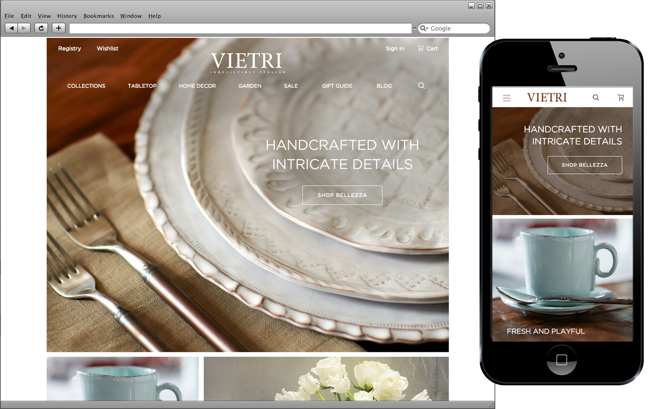
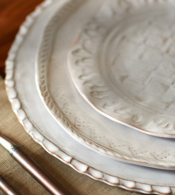 Vietri
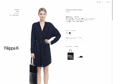
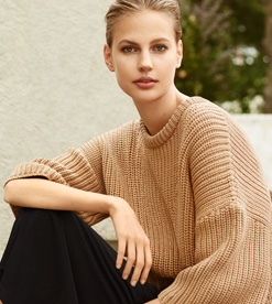 Filippa K
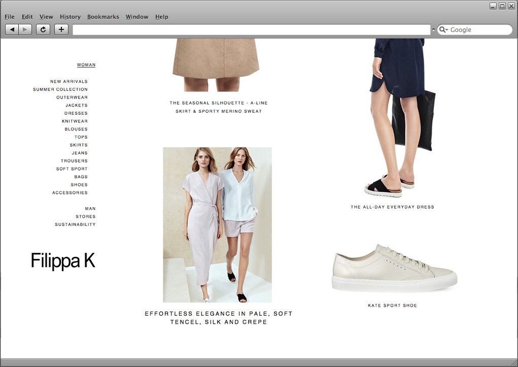
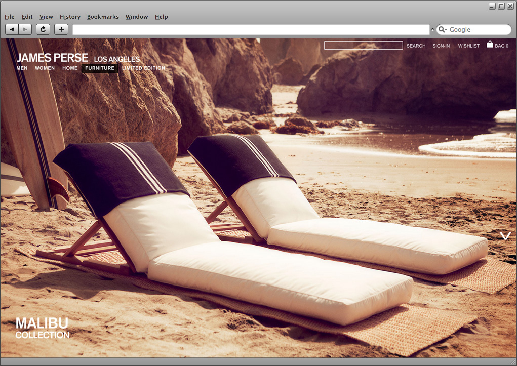
 James Perse
Every year at the Imagine Magento conference in Las Vegas, top Magento stores are recognized for their design & innovation. This years group is a small and diverse selection of creative and imaginative Magento Stores that will certainly set the bar over the next year. After reviewing this year’s selections, I have put together a list design trends & styles with a short explanation of why they work so well.
White space
White space has been trending for a while now, and it doesn’t look like it’s going anywhere. Designers have been taking the trend even further with vast expanses of white space and extreme minimalism. This technique works well for home goods, jewelry, and fashion. It’s extremely important to have great photography if you intend to implement this amount of white space.
Vast Grids of large images without clutter
Wide and long scrolling grids are one of the best ways to showcase products in a very visual way. The wide and simple grid works well for websites with heavy white space that are using minimalistic branding. This technique is very clean and visual appealing, but it doesn’t work well for products with lots of attributes and shoppers who prefer to narrow down as they shop.
Full width borderless, fluid layouts
Fluid layouts are fully responsive but still don’t feel boxed in. Some nice looking Magento websites reach edge to edge, with large images stacked vertically and with no space inbetween.
Responsive Design
Responsive design isn’t just a trend, it’s a must-have. Mobile first responsive designs are used by all of the best Magento stores and are easy to manage with one responsive theme and consistent content.
Centered Logos
Traditionally, logos have existed in the top left corner of a website, but lately the trend has been shifting to wide open headers with the logo placed neatly in the center. This is a great look for any website, but it’s important not to try and pack in content around the logo, as this space should remain as clean as possible. The trend doesn’t work well for retailers who need to add a lot of information in the header.
Delicate text styles and light, fine lines
One of my personal favorite trends is the use of light fine lines and more delicate text. Harsh, bold fonts with black boxes or any heavy elements give way to clean layouts and lines. I like this trend because it shifts focus to the images while also presenting a lot of information without overwhelming visually.
Vertical Scroll instead of horizontal slide
Some Magento stores are opting for a vertical scroll technique as opposed to the traditional horizontal image slider. This works well because it make the page look less complicated, as users are already comfortable with scrolling down. Without the use of fancy scripts, zoom, and othe effects, the page feels lightweight and simple.
In Conclusion
All four finalists in the Imagine Excellence Awards in Web Design are examples of forward thinking web design. These Magento Stores are clean and user friendly, and will certainly pave the way for many others to emulate and build upon these trends.
Customer Success Manager