There are many eCommerce stores on the internet, and your goal is to make your store stand out from the competition. In order to achieve this goal, you must present more than just the products you are selling – you must present a trustworthy brand that your shoppers know they can rely on. This is where your design comes in. Improving your website’s design is a great start if you want to pull in more conversions.
Here are some ways you can increase your conversions through design:
Choose the Right Colors
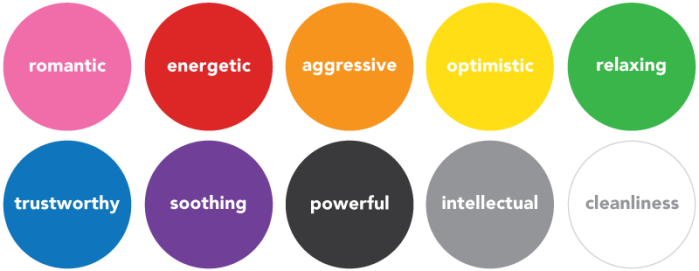
Color is one of the most important aspects of your website. Since color sets the overall tone and feel of your site, it’s crucial to consider what your brand is converying through color choice. If your eCommerce store is selling children’s toys, you may want to stick with primary colors (red, blue, and yellow) instead of deep tones which can be too harsh. A good color scheme for a spa would be earthly greens and blues. Here are some examples of emotions typically associated with popular colors:
Images are Important
A lot like color, your images make a memorable impact on your visitors. Sometimes it can be expensive and time consuming to take your own photographs. It’s okay to use stock images, but you have to keep in mind that some stock images don’t always feel authentic. When searching for the right images, keep in mind that they must match your brand.
Below are two photographs from the stock image provider Fotolia. Both of these images are results for the search query ‘chef’. The images contain similar content, but one is more convincing than the other. The people in the image on the right appear to be superimposed into the photograph — almost forcing a kitchen atmosphere. The image on the left shows a chef in action whereas the other image appears staged. The left image would be a better choice to use on your eCommerce site.
Another reason you may be losing visitors is by using clip art or low-res images. Low-res images can really hurt conversions. It doesn’t matter if it’s your home page slider or even your products, if a potential customer cannot properly see the product they want to buy, they will simply move on. Clip art also shows you’re not being original with your design and up to date with the latest trends. It’s not the 90s anymore!
Noticeable Call-to-actions
Call-to-actions help the visitor navigate through your eCommerce site. Sometimes you have to point them in the right direction. A call-to-action can be a button or even an arrow that points to where you want the visitor to go. Normally they are a different color and much larger so they can grab the visitor’s attention. They don’t have to be obnoxiously huge—just visible.
Where to place them on your site is important to think about too. You have a better chance of a click if the call-to-action is at the top or in the most visible area of your site. Not many people will scroll all of the way down to the footer.
Above are two examples of call-to-actions. The top example has large arrows pointing your attention to the ‘Shop All’ button. The second gets your attention with big text followed by a ‘Shop Now’ button with an arrow. Both let the visitor know where they need to go for the latest sale.
Product Presentation
Product Images
I can’t stress enough now important it is to have good, high-quality product images. Shoppers who are confused about the products they are purchasing may cause them to look elsewhere, so they need to be able to access multiple high-quality views of the product at different views and angles. If you offer a product in more that one style or color, upload images to represent each selection.
- Include a photo to show every angle of the product
- Include photos of every color and style of the product available
- Make the images large enough so that the shopper can zoom in, especially in products where detail is important.
Product Descriptions
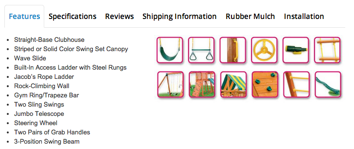
Product descriptions should be detailed and thorough, and leave no question about the product unanswered. A popular technique is to use informational tabs to separate information as to not overwhelm shoppers. It’s helpful to include size charts for clothing or housewares, and other information is required if you are selling specialty products.
Magento offers many possibilities when it comes to customizing product information. You can set up custom attributes and even separate attribute sets for different types of products. Shoppers who are more confident that they understand a product are more likely to purcahse it.
Related Products
Related products can help shoppers find products based on their tastes. As shoppers browse, related products can help guide them through the store to expose them to products they would be most interested in purchasing.
Include Media
Use of different media can enhance shoppers understanding of your products. Lately, the trend has been to add videos for clothing and shoes to show shoppers exactly how the product moves on an actual person. Since clothing shopping is often frustrating, any additional confidence you can give your shoppers will enhance your chances of selling your product.
Make Navigation Simple
It should be easy for shoppers to use your navigation and search functions to find exactly what they are looking for. It’s important to look at your inventory to decide the best way to organize the taxonomy on your Magento store. A simple dropdown navigation is easy to understand and translates well to responsive design.
If your inventory is so extensive and specific that traditional navigation won’t cut it – consider featuring an advanced search, like the ones typically found on airline websites and car re-sellers.
Make Important Information Easy to Find
There is certain information on your onine store that all of your visitors should be able to find quickly. These items, or links to these items should have a place on every single page of your website:
- Contact Information (Phone and Email)
- Help or Support
- Sales Information
- Shipping and Returns
- Newsletter / Mailing list sign up
- Location & Hours of your brick and mortar store if you have one
- SSL Certification
Whitespace is Your Friend
If you don’t know what whitespace (or negative space) is, it is when there is an area purposely left blank. Whitespace doesn’t have to be white. It generally means open space therefore, it can be any color. When you’re talking web design, it’s when there’s space between all the content (images, columns, text, etc.). This can make your eCommerce site easier to navigate while having more appealing design.
You don’t need to have a lot of text and images. Only a few strong images and a couple sentences can get your message across. Filling up the whole entire page with too many images and elements is not always ideal. Excess clutter will cause the visitor to get lost and leave your site. An overwhelmed visitor will most likely not come back. This is where you need to utilize your white space. Think about what you want to highlight the most and what could take a step back. Less is always more.
Conclusion
Keep in mind that your color scheme matters and high quality images that communicate properly with your brand will always look professional. Take advantage of call-to-actions. You’ll be surprised how many clicks you’ll receive just by adding some extra attention to the top of your page. Focus on your product presentation and the way your visitors access important information. Last but not least, remember whitespace isn’t always a bad thing. Your visitors will feel much more comfortable if your eCommerce site is clutter-free.
Graphic Designer
