Typography for the Web
A good font consists of many different aspects. Fonts can easily make or break your design therefore you must know from the very beginning if you’re choosing the right font for your website. Typography in the web can be easily overlooked even though it’s what people tend to look for first. It’s much more than adding text to a page. Actually, it’s a big part of the web design process. Choosing a font or multiple fonts is a lot harder than most people think. Designers need to consider hierarchy and balance when picking the most appropriate font.
Typography Examples
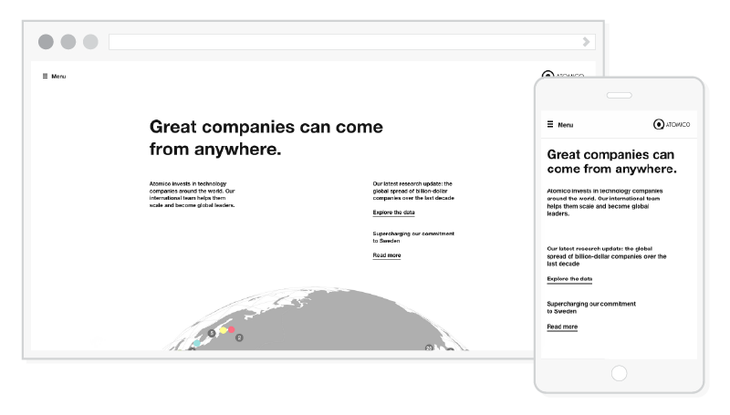
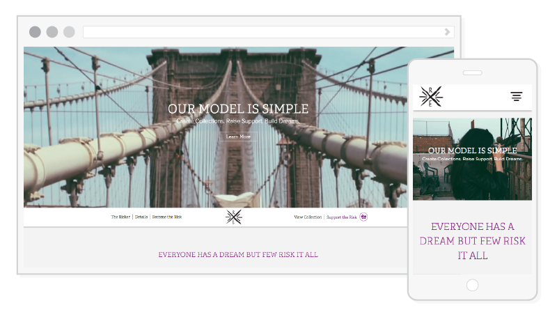
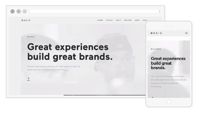
Below are four excellent examples of web typography.

Pennies
Here are a few useful tips to keep in mind for your next web design project:
- Keep it simple and stick with either one or two fonts. Three can be appropriate at times, but only use a third font if it’s only necessary. Bringing in a bunch of different fonts isn’t the best idea because your design will appear chaotic and unbalanced to the user. You don’t want them to feel overwhelmed when they visit your website, right? Using only one font is perfectly fine though. There are many high-quality fonts to choose from that come in different weights and styles. If you do plan to go down that route, take advantage of the different weights. It can be difficult to achieve contrast with only one weight.
- Think about contrast and compatibility when pairing fonts. Using similar fonts isn’t the best way to achieve hierarchy and contrast with your type. For example, if you use two san-serif fonts that are almost identical, your website won’t have that contrast you want to achieve. A good rule of thumb is to pair a san-serif with a serif font. They are already drastically different, yet still balance off each other.
- Know the difference between body copy and titles. Body copy is your paragraph text and titles are the headers. It’s important for the body copy to at least come in these styles: bold, italic, and bold italic. This font also needs to be legible at smaller sizes. Try avoid centering your text. Set the paragraph to align left instead. Centered text forms jagged edges and can get difficult to read. Also, keep in mind that titles or display fonts should be used sparingly. These types of fonts usually have more personality than the body copy. Think about the balance between the two.
- Avoid faux italics and bold. This only happens when the font does not have the appropriate weight and the designer forces the text to be either italic or bold. When a font is available in different styles, it was designed with proper kerning. Not only could the spacing be off with faux italics and bold, but the text will look awkward.
- Make sure the user will be able to read your content. This is pretty much a no brainer. If a user cannot read your content, there’s a high change they’ll leave your website. So, keep in mind the size and weight of your font. If your body copy is less than 13px, it’ll start to get a little difficult to read. Same goes with fonts that are available in really thin weights. It’s easier to get away with a thin font if it’s on the larger side. At a smaller scale, the user will have a much harder time trying to read your content.
- Be careful of the colors you choose. If your background is blue, you might not want to go with blue text. For example, if your background is dark blue, it would be wise to make your text white. If your background is light blue, black text would be easier to read. Keep in mind how screens can cause eye strain too. The colors you choose shouldn’t clash with each other.
Designing for Mobile
When you plan on designing for mobile, all of the rules that were listed above still apply. On mobile, text needs to be scaled for a better web design experience. First of all, remember your space is very limited on a mobile device and elements will need to be adjusted. This means your text must be the appropriate size. Body copy should be bigger on mobile for better readability, and large display fonts must be sized down so the font isn’t taking up most of the screen. Text that is too small will cause eye strain. It can make the user lose focus as well. If the text is too big, it’ll be even harder to read. It’ll start to break up causing the user to stop reading at awkward times. There wouldn’t be a natural flow.
Second, you have to consider the spacing. If you think about it, users are basically using a tiny computer. They need to be able to read your content comfortably. In order to achieve this, add padding around your content. This adds a cushion around your text, and it makes sure it isn’t sticking to the edges of the screen. Also, be cautious of the spacing between words. Don’t make the leading and line height too tight or too loose.
Content needs to be even simpler on mobile. Avoid using shadows or any type of fancy text decoration. It will make your text a lot harder to read on a smaller scale. Plus, it might not render correctly. Try to keep it desktop only.
Web Fonts to Choose From
Typekit
Google Fonts
Myfonts
Font Squirrel
Webkit
Lastly, test test test. Every mobile device is different. Does it look good at 320px? What about 480px? You could check on multiple devices, but you can use the Google Chrome Developer tools too. The developer tools allow you to easily test and view every screen size right in your browser.
Graphic Designer