


Many merchants who sell online think that the main factor influencing their conversions to go up or down is the design of their website. While design plays a role, it is not the main reason people buy or don’t buy from an online store. Look at Amazon, for example. Their website is not the most well-designed website, aesthetically speaking. Yet, they are the biggest online store.
So what does Amazon do regarding CRO that puts them at the forefront of eCommerce, and what can you do today to improve the CRO on your website?
This post will walk you through the main criteria an eCommerce website must meet to convert visitors into buyers and provide a list of 25 critical elements you should consider removing or modifying in your Shopify site immediately.
What is Conversion Rate Optimization (CRO)?
Conversion rate optimization is the practice of increasing the percentage of users who perform a desired action on a website. Desired actions, also called conversions, can include purchasing a product, clicking ‘add to cart, signing up for a newsletter, or filling out a form.
That said, there are five key factors that why visitors buy when they land on your website.
| Factor | What It Means | |
|---|---|---|
| 1 | Solve Your Visitor's Problem | Acknowledge your visitor's problem, want, or need, and show how your product satisfies or complements it. |
| 2 | Highlight Value | Strategic pricing, discounts, promotions, gifts with purchase, and personalization. |
| 3 | Simplified Delivery | Clearly communicate speed, cost, and shipping policy on product pages: "Ships within 24 hours," "Available for local pickup," "Same-day delivery." |
| 4 | Customer Support | State your returns, refunds, and warranty details. Include an FAQ section with preemptive questions on the PDP. |
| 5 | Social Proof | Display reviews and ratings prominently, show customer testimonial videos, and highlight any awards or recognitions. |
Solve Your Visitors Problem
When a visitor first lands on your website, we need to focus on acknowledging the visitor’s problem, want, or need and showcase how your product solves this issue.
You can accomplish this by using product descriptions and images that highlight the benefits (not just features or specs) and directly address the customer’s concerns. The clearer we are about how the product solves the customer’s problem, the better.
For example, I am a big coffee drinker and like espresso.
When shopping for my Barista Express a few years back, I was looking for an espresso machine that would be convenient and reliable for brewing coffee at home. I looked at the different photos of the coffee machine and envisioned how it would look on my countertop and enhance my morning routine, not how the coffee machine worked internally.
Highlight Value
The 2nd reason that helps your visitors convert is value. When setting or coming up with a price that someone is willing to pay that much for their problem or want or need to go away, we need to consider the following:
We need to be competitive as price is one of the key factors impacting conversions. To provide additional value, if possible, offer free shipping on everything.
If you can’t do that, you can offer a free shipping threshold. For example, free shipping on all orders over $99. The key term here is to have the word FREE so people know they are getting something for free.
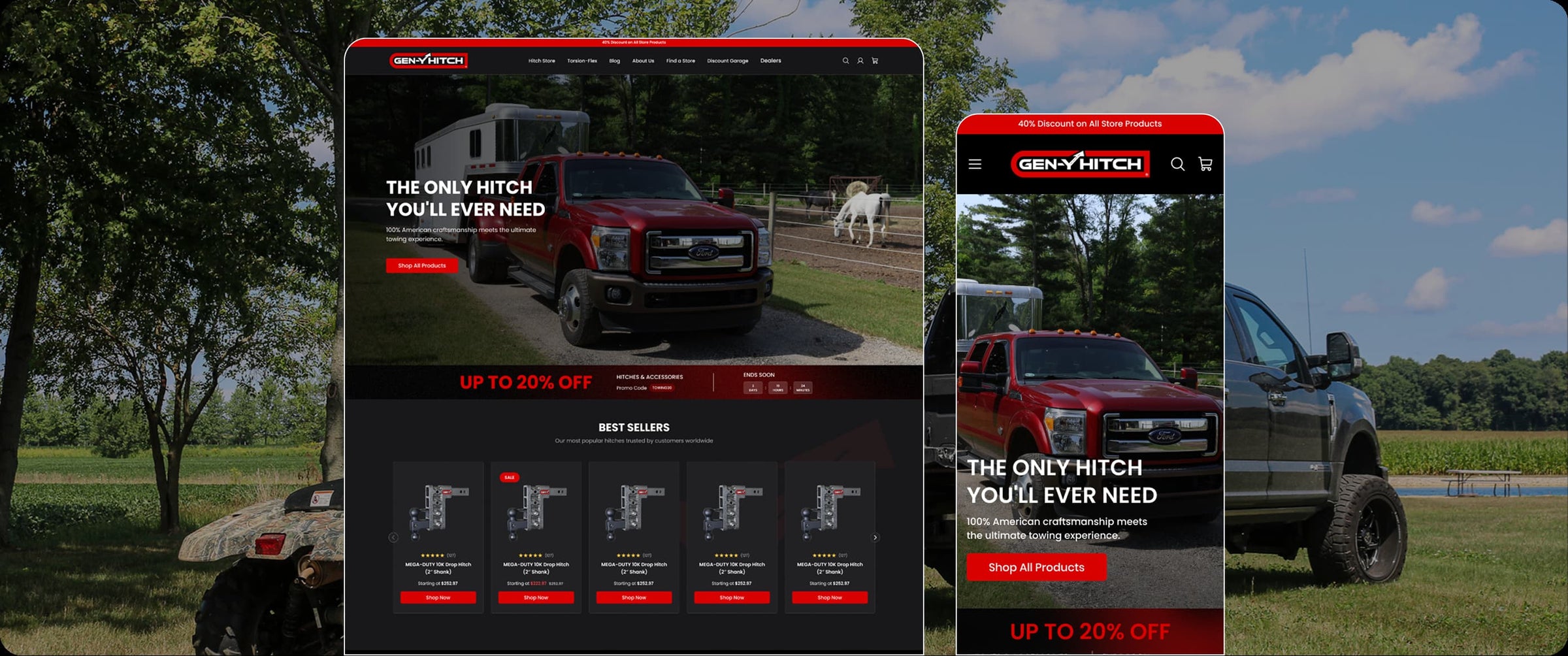
An example of highlighting limited discount on our client GEN-Y Hitch's store, which we migrated from WooCommerce to Shopify.
In addition to free shipping, consider the following: Can we offer a free add-on, free gift wrap, a personalization option, a free manual, or a free e-book?
In my case, I was offered a pack of coffee beans from their top-rated coffee. When your price is above the competition, emphasize the superior build quality, energy efficiency, or distinctive features that set your product apart.
Last, from time to time, offer promotional discounts, highlighting the difference between the original and the promotional price and savings.
Simplified Delivery
When someone decides to buy a product from your website, they need to know how fast they’ll get the product, how much it will cost them, and if there are any other hidden costs.
Clearly communicate delivery details like speed, cost, and any other shipping policies directly on the product pages. This transparency in logistics can help reduce customer hesitance due to uncertainties.
It is advisable to display directly on the product page: “Ships within 24 hours with 2-day free shipping. You can mention that the product is available for local pickup as an alternative or same-day delivery in certain cities where you have a 3PL inventory or warehouse. Include a dynamic estimate of the delivery date based on the customer’s location.
The above will boost the buyer’s confidence that they will get their order quickly when they buy from you.

An example from CBDistillery of clearly communicate speed, cost, and shipping policy details on product pages or any restrictions.
Customer Support
After a visitor has decided that your store is where they will likely buy from, they need to know what happens if something goes wrong. They need to understand whether there is a refund policy or a warranty. For them to follow through and complete their order, you have to offer strong support signals, like clearly stating any warranties or refund policies, to assure potential buyers of the offer’s reliability and longevity.
If your product has a 2-year warranty, highlight this on the product page. Ensure the refund policy is easy to find and clearly states, for example, “30-day money back if not satisfied.”
Including a frequently asked questions (FAQ) section can further help by preempting common questions. In my coffee machine example above, this section included information such as maintenance, compatibility with different coffee types, and troubleshooting steps.
More and more websites feature a live chat option during business hours and a dedicated support hotline or email for more detailed inquiries. Last, make sure your website has a physical address for your business.
State details about returns, refunds & warranties. Include FAQ section with preemptive questions on PDP. Highlight details “2-year warranty”, “30-day money back guarantee”.
Social Proof Through Reviews, Testimonials, and Endorsements
One of the biggest aspects of buying from Amazon has always been product reviews. Use reviews, testimonials, and authoritative endorsements (like awards) to build trust and confirm the product’s effectiveness. You should highlight these elements prominently to capitalize on the societal trust factor. When it comes to product reviews on Shopify, hundreds of apps are available. Platforms such as Yotpo or Bazaarvoice make adding and requesting reviews from your clients a breeze.

Example of using UGC content as a powerful Social Proof from Bedouin's Daughter
A review system where customers can rate your product and leave feedback will instantly improve your conversions. Display the star ratings prominently at the top of the product page, preferably close to the title of the product, not way down.
You can take it one step further and show video testimonials of satisfied customers showcasing their use of the product.
If applicable, display any awards or recognitions the product or your company has received for quality or innovation. Display reviews/ratings prominently, show customer testimonial videos and highlight awards/recognitions for your product.
Now that we have reviewed the five most important factors impacting conversion rate on an eCommerce website let’s review a list of the 25 often overlooked items that can directly impact your CRO efforts.
The 25 Shopify CRO Fixes at a Glance
| Fix | Where It Lives | |
|---|---|---|
| 1 | Lead With Mobile Wallets at Checkout | Checkout Page |
| 2 | Simplify the Checkout Process | Checkout Page |
| 3 | Show Shipping Costs Before Checkout | Product Page / Cart |
| 4 | Offer Guest Checkout | Checkout Page |
| 5 | Cut Redundant Trust Badges | Product Page |
| 6 | Display Contact Information Prominently | Homepage / Footer |
| 7 | Remove Intrusive Live Chat | Site-Wide |
| 8 | Fix Your Product Feed and Structured Data | Product Page (Backend) |
| 9 | Create Unique Product Descriptions | Product Page |
| 10 | Add a Sticky Mobile Add-to-Cart Bar | Product Page |
| 11 | Streamline Product Recommendations | Product Page |
| 12 | Avoid Technical Jargon | Product Page |
| 13 | Optimize Media Files | Site-Wide |
| 14 | Declutter Shopify Apps | Site-Wide (Admin) |
| 15 | Minimize Flashy Animations | Site-Wide |
| 16 | Disable Autoplay for Media | Site-Wide |
| 17 | Ensure Readability with Fonts and Colors | Site-Wide |
| 18 | Simplify Navigation Menus | Homepage / Header |
| 19 | Remove Stock Images | Product Page |
| 20 | Relocate Social Media Icons | Homepage / Footer |
| 21 | Limit Intrusive Pop-ups and Overlays | Site-Wide |
| 22 | Keep Forms and Surveys Short | Contact / Checkout |
| 23 | Remove Unnecessary Slideshows | Homepage |
| 24 | Clarify Calls to Action (CTAs) | Site-Wide |
| 25 | Give the Thank You Page a Job | Order Confirmation Page |
1. Lead With Mobile Wallets at Checkout
Shop Pay, Apple Pay, and Google Pay need to be visible the moment someone reaches checkout, not buried under a full billing form. Most mobile shoppers abandon right there, the second they have to type in a card number by hand.
Put the wallet buttons above the fold on the cart and checkout pages, not just the product page. If someone has to scroll to find a one-tap payment option, you've already lost the speed advantage it was supposed to give you. This is the same friction we mapped across dozens of Shopify checkouts in our checkout mistakes breakdown.
2. Simplify the Checkout Process
Eliminating any unnecessary form fields can make the checkout process smoother and more efficient.
The more straightforward and streamlined the process, the more likely your customers will be to complete their purchase without frustration or confusion.
If you use Shopify, using Shop Pay is the first step towards a simplified checkout and is highly recommended. A really good example of Shopify’s one-step-checkout is Supreme.

The general rule of thumb is that one-page checkout is better for a younger audience, lower AOV products, and mobile traffic.
What can you edit in the Shopify Checkout?
If you're on a Basic, Grow, or Advanced Shopify plan, you have more checkout customization power in 2026 than you did a few years ago. Yet, plus customers have much more flexibility.

3. Show Shipping Costs Before Checkout
Surprise costs at checkout are still the single biggest reason carts get abandoned. Baymard's research puts it at the top of the list by a wide margin, ahead of forced account creation and slow delivery estimates combined.
If a visitor doesn't know what shipping costs until the final step, you've made them do all the work of building a cart just to hand them a reason to leave. Show the number on the product page or the cart page, not for the first time on the payment screen.
4. Offer Guest Checkout
One way to increase conversions on your website is to offer a guest checkout option. This means that customers can complete their purchases without creating an account. Doing so can lower the barriers to purchase and decrease cart abandonment.
This is because some customers may not want to go through the hassle of creating an account, especially if they make a one-time purchase. Offering a guest checkout option makes the process more convenient for them, which can lead to more sales and happier customers. It’s a small change that can greatly impact your business.
5. Cut Redundant Trust Badges
A row of five generic "SSL Secure," "Verified," and payment-icon badges doesn't read as trust anymore. It reads as noise, and shoppers scroll past it the same way they scroll past a banner ad.
Keep the one or two badges that are actually specific to you, a real review count, a real guarantee, a real security certification, and cut the rest. Fewer, sharper trust signals outperform a wall of icons.

6. Display Contact Information Prominently
One of the critical aspects of building a trustworthy and customer-centric eCommerce website is to make your contact information prominently visible. Customers are likely to feel more comfortable and secure when they know they can easily reach out to you for assistance, whether it’s to ask questions, report issues, or seek clarification.
To ensure that your contact information is easily accessible, consider displaying it on your website’s homepage, in the footer section, or on a dedicated “Contact Us” page. You should provide multiple ways for customers to get in touch, such as phone numbers, physical address, email addresses, and social media links. Also, ensure the information is accurate and up-to-date to avoid frustration and confusion.
7. Remove Intrusive Live Chat
Integrating a non-intrusive live chat feature is an effective way to enhance user experience and improve conversions on your website. This will allow your users to easily seek help and support without feeling overwhelmed by unsolicited pop-ups or intrusive messages. By offering non-disruptive live chat support, users will feel more comfortable and in control, as they can initiate the conversation at their own convenience.
8. Fix Your Product Feed and Structured Data
Broken or missing structured data doesn't just cost you rich results in Google. It costs you visibility everywhere your products get pulled into, including AI answers and shopping surfaces that read your feed instead of your page.
Audit your product schema the same way you'd audit a broken link. Missing price, availability, or review markup is a silent conversion leak, because it means fewer qualified visitors ever reach your PDP in the first place.


Example of how a complete PDP schema looks from our 10 real examples LLM-Friendly Product Pages article
9. Create Unique Product Descriptions
Many eCommerce websites use manufacturer-provided descriptions or vague descriptions. Creating unique product descriptions is crucial.
By crafting detailed and unique descriptions for each product, you can give potential buyers a better understanding of what they are purchasing and why they should choose your product over others. Moreover, unique product descriptions also help search engines like Google understand your content better, leading to higher rankings in search results. This is not a small problem.
When we ran our duplicate content study, roughly one in five product descriptions across the stores we checked were copied word for word from a manufacturer feed or a competitor.

Those stores were not just fighting each other for rankings, they were invisible to the answer engines that now read the web before a shopper does. Good descriptions are only half the job on a product page, though. Layout, trust signals, and how the page handles proof matter just as much, which is why we broke down what actually separates a converting Shopify product page from one that just looks nice.
So, invest some time and effort in creating compelling and distinctive product descriptions to improve your online store’s visibility, engagement, and credibility.
10. Add a Sticky Mobile Add-to-Cart Bar
On mobile, the buy button scrolls out of view the moment someone starts reading product details, reviews, or specs. Every scroll down is a small chance they forget why they came.
A sticky bar that pins the product name, price, and an add-to-cart button to the bottom of the screen keeps the path to purchase one tap away no matter how far someone scrolls. Most Shopify themes support this natively or through a lightweight app, and it costs nothing to test.
11. Streamline Product Recommendations
To optimize the user experience and boost sales, it’s essential to streamline product recommendations. This involves ensuring the recommended products are relevant to the user’s search queries, browsing history, and purchase patterns.
Businesses can personalize product recommendations by leveraging user data, ensuring that they meet the user’s needs and preferences. Random selections can be confusing and overwhelming for customers, which may lead to lower engagement rates and cart abandonment.
For powerful product recommendations on your Shopify store, consider apps like Rebuy AI (AI-driven personalized recommendations), Shop Quiz by RevenueHunt (interactive quiz-based recommendations), and StoreFrog (various recommendation types with customizations).
Shopify also offers built-in product recommendation capabilities through their themes and Search & Discovery app, allowing merchants to display related and complementary product suggestions without a third-party app.
12. Avoid Technical Jargon
When it comes to eCommerce, it’s important to avoid using technical jargon in your product descriptions, marketing materials, and website content. Instead, focus on writing in plain language that is easy for all potential customers to understand. This will not only enhance the overall user experience but also increase conversion rates. Using technical terms or complicated language can be a major turn-off for customers who may not have the same level of knowledge or expertise as you do.
Look at the following example of how a smart phone’s description could be adjusted to avoid technical jargon:
XYZ Smartphone Features:
Display: 6.5-inch Diagonal AMOLED with 3200×1800 resolution, 450 PPI, HDR10 support.
Processor: Octa-core 3.1 GHz AX9 processor with 12nm architecture and enhanced quantum throughput.
Battery: 4050 mAh featuring advanced lithography power management.
Simpler Version:
Clear Viewing: Enjoy a large, bright screen perfect for all your media.
Fast Performance: Our quickest phone yet, handling all tasks smoothly.
All-Day Battery: Stay powered from morning until night without recharging.
By translating complex terms into benefits-focused language, your brand can help customers understand what they’re buying and why it matters, enhancing the shopping experience and increasing the likelihood of purchasing.
Therefore, it’s crucial to simplify your language and make it accessible to everyone, regardless of their background or familiarity with the subject matter.
13. Optimize Media Files
One of the most effective ways to optimize your website’s performance is to compress the images and videos on your site without compromising their quality.
Compressing multimedia files reduces their file size, making them load faster, which, in turn, speeds up your site’s overall performance. Additionally, faster load times positively impact your site’s SEO rankings, as search engines tend to prioritize sites that provide a better user experience. We measured exactly how much this matters across 1,000 Shopify stores in our Core Web Vitals benchmark, and the gap between fast and slow sites was bigger than most merchants expect.
On Shopify, automated tools like Crush Pics and SpeedSize can optimize images at scale without manual effort.
14. Declutter Shopify Apps
Running a high-performing Shopify store is crucial for driving eCommerce growth. One key area that often gets overlooked is the sheer number of apps and plugins weighing things down. As an agency, we’ve seen far too many merchants install every shiny new app under the sun without really evaluating if they truly need it.
Take a hard look at each app. If it’s not directly impacting conversions or delivering a stellar customer experience, ditch it. A lean tech stack translates into faster load times and a frictionless user journey. We see this constantly. Stores running a handful of apps load fast.
Stores running a dozen do not, and the biggest single predictor is how much JavaScript those apps are quietly injecting on every page.

Example of how to reduce on how to audit Shopify scripts and apps for faster load times
15. Minimize Flashy Animations
When creating an eCommerce website, it’s important to ensure that your design choices don’t detract from your main goal, selling your products. One common pitfall is the use of flashy animations. While these can be eye-catching, they can also be distracting, taking attention away from your products and important messages.
To avoid this issue, it’s best to opt for a clean, straightforward design. This doesn’t mean that your website has to be boring or unappealing, but rather that you should use animations selectively and in a way that enhances rather than detracts from the user experience. For example, you might use a subtle animation to draw attention to a call-to-action button, but avoid using flashy animations that might overwhelm or distract your users.
16. Disable Autoplay for Media
When it comes to creating a positive user experience on eCommerce websites, it’s important to consider the impact of autoplay for media like videos or audio. While autoplay may seem like a convenient feature, it can actually be quite disruptive for users who may not be expecting it.
When media begins playing automatically, it can be distracting and frustrating, which can lead to users leaving the site altogether, also known as “bounce rate.”
To avoid these issues, it is recommended to disable autoplay for media and instead allow users to decide when they want to play it. This gives users greater control over their site experience and helps to ensure that they stay engaged with the content.
17. Ensure Readability with Fonts and Colors
When creating content, it is important to ensure readability for all users. One way to achieve this is by choosing clear and legible fonts. Sans-serif fonts like Arial or Helvetica are often preferred for digital content due to their clean and modern look. Font size is also important, as text that is too small can be difficult to read. A font size of at least 16px is recommended for body text.
In addition to font choice and size, it is important to consider color contrast. For users with visual impairments, a lack of contrast can make it difficult to read text. To ensure readability, choose colors that contrast well with each other. Black text on a white background is a classic example of high contrast and readability.
However, other combinations, such as white text on a dark background, can also work well as long as the contrast is strong enough. By using clear, legible fonts and contrasting colors, you can make your content accessible and easy to read for all users.
18. Simplify Navigation Menus
One of the key aspects of designing a user-friendly website is to ensure that the navigation menus are simple, clear, and well-organized.
Navigation menus serve as a road map for visitors to navigate your website easily and efficiently.

Example from our clients Just Candy and how they organise collection and product page navigation
They are crucial in improving user experience, engagement, and conversions. By simplifying the navigation menus, you can guide your visitors smoothly through your site, making it easier for them to find what they want. This not only enhances the overall user experience but also increases the chances of visitors staying on your website for longer periods of time, exploring more content/products, and ultimately converting into loyal customers.
19. Remove Stock Images
When setting up an eCommerce website, using high-quality images to showcase your products is crucial. Clear and detailed visuals help customers make informed decisions and positively impact their perceptions of your brand.
Investing in high-quality images can also increase customer engagement, improved conversion rates, and reduced return rates. Therefore, it is essential to prioritize image quality and ensure that images are optimized for web use, so they load quickly and do not compromise website performance.
Heavy, unoptimized media is still one of the biggest drags on page speed that our speed benchmark of 1000 Shopify pages surfaced.
 The LCP (Core Web Vital) drastically improves when compressing large images
Additionally, using multiple images from different angles and perspectives can provide customers with a better understanding of the product and increase their confidence in the purchase decision.
20. Relocate Social Media Icons
When designing your website, it’s important to consider the placement of your social media icons. While it’s great to promote social engagement and connect with your audience, it’s also important to keep your visitors focused on your products and services.

Placing your social media icons in the footer of your website can be a great way to strike a balance between promoting engagement and keeping visitors on your site. By doing this, you’re ensuring that your sales funnel takes precedence and that visitors are encouraged to explore your offerings before potentially exiting your site.
21. Limit Intrusive Pop-ups and Overlays
While using multiple popups on a Shopify website can be effective for growing an email list and promoting offers, it must be done cautiously to avoid annoying or overwhelming visitors. Only opt for essential popups, such as age verification, email capture on the homepage, exit intent on the cart page, and promotion on product pages, to avoid turning off users with intrusive and disruptive interruptions.

The general consensus seems to be that while 2-3 strategic popups can be valuable, going overboard with excessive or ill-timed popups risks annoying visitors and negatively impacting the user experience.
22. Keep Forms and Surveys Short
It is important to request only the essential information in forms to improve the overall conversion rate and reduce user frustration and abandonment rates. This means that the information requested should be limited to what is absolutely necessary and relevant to the intended purpose of the form. Additionally, it shouldn’t take too long to submit a contact form. Look at the Kettle & Fire example below which states that it takes on average 7 minutes to submit their contact form.

Instead, keep the forms short and to the point like Painful Pleasures, one of our clients, below:

By doing so, users are more likely to complete the form without experiencing any unnecessary frustration or confusion, leading to increased engagement and conversions.
23. Remove Unnecessary Slideshows
The goal of the homepage is to direct people elsewhere. It can be tempting to try and cram every marketing message into a rotating carousel, it’s the easy way to keep everyone on the team happy without anyone’s pet project getting left out.
But is keeping the peace worth sabotaging your conversion rates? At the end of the day, your homepage needs to have a clear, singular focus that aligns with your highest-impact goals and customer motivations.
Anything that distracts from the primary message and calls to action will just prevent people from taking the action you want them to take.
Ditch the distracting carousel in favor of a powerful, focused homepage that guides visitors straight to your top conversion goals. Everything else can take a back seat or live on deeper pages.
24. Clarify Calls to Action (CTAs)
To improve your website’s conversion rate, it is important to have a well-defined and clear call-to-action (CTA) on every page. A CTA is a button or link that prompts the user to take a specific action, such as adding a product to their cart, completing a purchase, or subscribing to your newsletter.
Having a clear CTA is essential to guide users naturally through the purchasing process and make it easy for them to take the desired action.
The CTA should be prominently displayed on each page and consistent throughout the website to avoid confusing the user. It is also important to use concise, action-oriented language, and relevant to the user’s needs.
For example, the CTA for a product page could be “Add to Cart” or “Buy Now”, while the CTA for a newsletter subscription could be “Sign Up” or “Subscribe”.
Clarifying the CTAs on an eCommerce website can improve the user experience, increase engagement, and ultimately drive more sales.
One of my favorite books for effective calls to action is Headlines, Subheads & Value Propositions by Joana Wiebe.
25. Give the Thank You Page a Job
Most Shopify stores treat the order confirmation page as the finish line. It isn't. It's the one page every single buyer sees, and most stores waste it on a blank "thank you" and nothing else.
Use it to set expectations (when the order ships, what to expect next), and to open the next conversation, an account creation prompt, a referral offer, or a simple next-step nudge. It's the highest-attention page on your entire site, right after someone has already said yes.

Apps like Order Editing allow advanced customization of Thank you and Order status pages beyond what native branding settings cover.
Conclusion
By implementing these changes, you can significantly improve your Shopify site’s performance and user experience.
Remember, the goal is to make your site as navigable and user-friendly as possible to maximize conversions and customer satisfaction. Regularly review your site for these common pitfalls and adjust as necessary to maintain an optimal online storefront.
If you'd rather have someone run this audit for you, that's exactly what our Shopify CRO service does, item by item, on your actual store.

